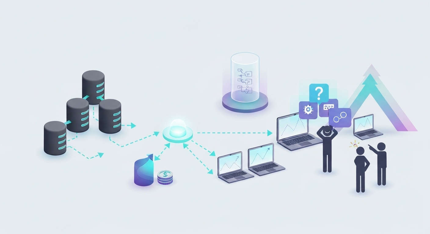

A dashboard can look confident and still be wrong. A chart doesn’t know if the number behind it came from a broken selector. It just draws the line. This post covers what actually has to happen between a scraped page and a chart someone trusts. Four steps, in order, before the first pixel renders.
A Dashboard Is Only as Honest as Its Feed
A chart doesn’t validate its own inputs. It renders whatever number reaches it: a real price, or a scraping error that looks like one. A dashboard built on raw, unvalidated scraped data inherits every failure in that pipeline. It just hides those failures behind a clean line chart.
This is the actual gap between scraping and visualizing. Extraction gets a page’s data onto disk. Visualization assumes that data is already correct, deduplicated, and current. Nothing enforces that assumption automatically. Four specific steps do.
Why an Ad Hoc Script Turns Into a Broken Dashboard Later
An ad hoc scraping script and a dashboard-ready feed start out looking the same. Both return data. The difference shows up weeks later, when a stakeholder asks why last Tuesday’s chart doesn’t match this Tuesday’s. The answer usually turns out to be a field that got renamed somewhere in between. Nothing threw an error. Nothing warned anyone.
A script written to answer one question today has no reason to enforce a stable schema. A script written to feed a dashboard does. A dashboard assumes the shape of its input stays constant. That assumption breaks first when an exploratory scrape gets pressed into service as a recurring feed. It usually breaks right after a team has already started deciding things from it.
Four Steps Before the First Chart
Four steps sit between a scraped page and a dashboard someone actually trusts. Skip one, and the chart still renders. It just renders something wrong.
Step 1: Define the schema before the crawl runs
A scraper without a target schema collects whatever the page happens to have. A dashboard needs specific fields in a specific shape, every time. Defining that schema first turns an exploratory scrape into a repeatable pipeline.
Price becomes a float, not a currency-formatted string. Dates become ISO 8601, not a mix of formats across sources. Categories map to a fixed list before extraction begins, not after a chart already broke.
Step 2: Validate and normalize before the data reaches the BI tool
A dashboard tool has no way to know a price field is empty. It doesn’t know if a selector broke, or if the product is actually free. It just plots zero. The validation and deduplication work covered here has to run before data reaches a chart. It can’t wait until someone flags a suspicious spike.
Normalization matters just as much. A price arriving as a string in one feed and a float in another breaks a chart. The chart expects one consistent type. Data normalization turns several source-specific schemas into one schema a dashboard tool can actually read.
| Failure | Effect on a dashboard |
|---|---|
| Duplicate record | Inflates an average or count metric |
| Null price treated as zero | Drags an average down silently |
| Stale record | Flatlines a trend line that should be moving |
| Format mismatch | Aggregation throws an error or silently drops rows |
Step 3: Match the storage format to how the tool reads it
A BI tool doesn’t consume raw scraped JSON directly. Most connect to a table, a warehouse, or a flat file on a schedule. The format decision determines how much transformation work happens before a chart can render.
# Aggregate validated, deduplicated product records into a chart-ready table.
# Input: a list of clean product dicts. Output: average price per category.
import pandas as pd

def price_by_category(records: list[dict]) -> pd.DataFrame:
    """Return average price per category, rounded to two decimals."""
    df = pd.DataFrame(records)
    summary = df.groupby("category")["price"].mean().round(2)  # 1. group and average
    return summary.reset_index(name="avg_price")                # 2. flatten for export
Sample input:
records = [
    {"category": "headphones", "price": 129.99},
    {"category": "headphones", "price": 149.00},
    {"category": "monitors", "price": 249.50},
]
Sample output:
     category  avg_price
0  headphones     139.50
1    monitors     249.50
This table is what actually feeds a chart. CSV, JSON Lines, or a direct connection to a data warehouse all work. Each one just needs to match what the BI tool consumes natively. A raw HTML dump doesn’t.
Step 4: Match the refresh cadence to the decision cadence
A chart that updates once a week is fine for a quarterly market review. It’s useless for a same-day repricing decision. Data freshness and data timeliness matter here the same way they matter for a model. The crawl schedule has to match how often the underlying value actually changes.
A dashboard that looks current but runs on a three-day-old crawl gives a false sense of confidence. That’s often worse than a dashboard that’s honest about its own lag.
Which Chart Type Breaks First
Not every chart hides bad data the same way. A line chart smooths a single bad day into the trend, since one point barely shifts an average. A bar chart makes a duplicate obvious, since two near-identical bars sit right next to each other. A pie chart hides a missing category entirely. It just resizes the remaining slices to fill the circle.
| Chart type | What bad data looks like |
|---|---|
| Line chart | A single stale point barely shifts the trend |
| Bar chart | A duplicate record shows up as two near-identical bars |
| Pie chart | A missing category disappears, the rest silently resize |
| Scatter plot | An outlier from a scraping error stands out immediately |
A scatter plot is usually the fastest way to catch a validation gap before it reaches a stakeholder. It’s also the chart type teams check least often. It’s harder to read at a glance than a clean bar or line chart. That’s exactly why it gets skipped in favor of the summary view.
Matching the Format to the BI Tool
Different BI tools expect different inputs. Getting this wrong means building a custom connector instead of pointing a tool at a table it already understands natively.
| BI tool | Preferred input |
|---|---|
| Tableau | A live database connection or an extract file |
| Power BI | A structured table, direct query or scheduled refresh |
| Looker Studio | A connected sheet, database, or supported connector |
| A custom internal dashboard | Usually a REST API or a warehouse query |
None of these tools want a raw HTML page or an unstructured JSON blob. Matching the format to the tool a team already uses avoids a translation layer nobody asked to build.
What a Broken Dashboard Actually Costs
A pricing team pulling a competitor average from a dashboard doesn’t re-verify every number behind it. They see the chart, trust the line, and act on it. That’s the entire point of the dashboard. It only works if the number behind the line is actually real.
Say one retailer’s feed has three duplicate SKUs sitting in that day’s average. Each one inflates the number by a few dollars. The chart shows a competitor pricing higher than they actually are. The team holds its own price steady, assuming it’s already competitive. It isn’t. The chart never shows why.
A skew check catches this before the average ever reaches the chart:
# Flag a category average that's likely skewed by duplicate records.
from collections import Counter

def flag_skewed_average(records: list[dict], dup_threshold: int = 2) -> bool:
    """Return True if any (title, price) pair repeats past the threshold."""
    pairs = [(r["title"], r["price"]) for r in records]
    counts = Counter(pairs)
    return any(count > dup_threshold for count in counts.values())
Sample input: three records sharing the same ("Sony WH-1000XM5", 149.00) pair
Sample output: True (average flagged for review before it reaches the chart)
Alerting on the Chart, Not Just the Pipeline
A pipeline can pass every validation check and still hand a dashboard a number that’s technically clean but strategically wrong. A category with zero listings that day is a clean number. It’s also a broken signal. Field-level validation doesn’t catch that. Chart-level thresholds do.
A simple rule catches most of this. Alert when a metric moves more than a set percentage between refreshes. Alert when a category’s record count drops to zero. That alert goes to whoever owns the dashboard, not just whoever owns the pipeline. A stakeholder trusting a chart deserves a warning before they act on a number that shouldn’t be trusted yet.
What Belongs in the Pipeline, and What Belongs in the Dashboard
It’s tempting to fix a bad number inside the BI tool itself, a filter here, a manual exclusion there. That fix disappears the next time someone rebuilds the chart from scratch. Nobody remembers why the filter was there in the first place.
Validation, deduplication, and normalization belong in the pipeline, upstream of the dashboard. The dashboard’s job is to visualize clean data, not to patch dirty data on the way in. Keeping that boundary clear is what makes a dashboard rebuildable by someone other than whoever originally built it.
Where This Shows Up: A Competitive Pricing Dashboard
A growth team building a pricing dashboard for Amazon, Target, and Best Buy needs all four steps working together. The schema defines price, category, and availability up front. Validation and deduplication run before any record reaches the chart. The data lands in a warehouse the BI tool already connects to. The crawl schedule matches how often retail prices actually move.
Skip any one step and the dashboard still loads. A missing validation layer lets a two-dollar scraping error sit next to real prices in the same average. A mismatched refresh cadence makes a three-day-old number look current. Beyond raw extraction, an analytics layer built on validated data turns a feed into a decision-ready dashboard. It’s more than just a chart.
The Same Steps, a Different Industry
The same four steps apply outside e-commerce. A real estate market dashboard tracking Zillow-style listings needs a schema that separates active, pending, and sold status. A single generic status field copied verbatim from each source won’t hold up across listing sites that label things differently.
A trend line showing median days-on-market only means something if every source reports that field the same way. Data consistency checks confirm that three listing sources actually agree on what “active” means. Only then can the dashboard treat their numbers as comparable.
When a Dashboard Isn’t Even the Right Deliverable
A dashboard is the right deliverable when a team checks a number regularly and reacts to it visually. It’s the wrong deliverable when a single analyst needs to run ad hoc queries against raw data. It’s also the wrong deliverable when a downstream system needs to consume values programmatically, not a human reading a chart.
A live API endpoint or a warehouse table works better than a dashboard for that second case. Building a dashboard nobody looks at just adds a translation layer instead of removing one. Sometimes what was actually needed was a clean API another system could query. The four steps above still apply either way. Only the last mile changes.
Real-Time Isn’t Always the Right Target
Real-time sounds like the obvious goal for any dashboard. It isn’t always the right one. A live API poll every few minutes makes sense for a repricing engine reacting within the hour. It’s overkill for a market-trend dashboard a team checks once a day.
Matching cadence to actual decision speed keeps cost and complexity down. A near-real-time feed, refreshed every few hours, covers most competitive-monitoring dashboards without the infrastructure cost of true real-time polling. The decision consuming the chart should set the cadence. A default assumption that faster is always better shouldn’t.
| Use case | Reasonable cadence |
|---|---|
| Same-day repricing decision | Hourly or live API |
| Competitive monitoring dashboard | Every few hours |
| Quarterly market review | Weekly |
| Historical trend analysis | Daily is usually enough |
From a One-Off Snapshot to a Live Dashboard
A one-time market snapshot can tolerate a manual export into a spreadsheet chart. A live dashboard a team checks daily can’t. At that point, extraction, validation, and delivery all have to run on the same schedule, unattended.
DataFlirt builds pipelines for scheduled, recurring crawls as a first-class case, not a one-off script re-run by hand. Output can land directly in S3, MongoDB, or a data warehouse a BI tool already reads from. A schema-drift alert catches a broken feed before a dashboard quietly goes stale.
Each stage feeds the next. Skip validation and a chart still renders, just not correctly. Skip cadence matching and a chart looks current when it isn’t.
Scraping competitor data for an internal dashboard is generally lawful in the U.S. Specifics vary by site and jurisdiction. See the full breakdown before scraping personal or gated data.
Next Steps
Choose DataFlirt if:
- The dashboard needs daily or near-real-time competitor data.
- Validation and normalization need to happen before data reaches your BI tool.
- Data needs to land directly in S3, a warehouse, or another existing pipeline.
- There’s no in-house data engineering team to build and maintain this.
Look elsewhere if: DataFlirt runs on cloud infrastructure and third-party proxy vendors rather than owning infrastructure in-house. That’s true of nearly every provider in this space, so it isn’t a differentiator against alternatives, but it’s worth knowing if in-house infra ownership is a hard requirement.
Get a scoped quote for your dashboard’s data feed. Most one-time extraction projects are delivered in 3-4 days.